Credit: Quit Bitchin’ and Get Your Glyph On Sketchnotes by Mike Rohde
Our Creative Director Jon Tan, well-known for his love of typography and its use on the Web and in print, shared his insights at two recent gatherings. As the business world takes note of well-considered design’s influence on a company’s success, demand grows for typographic expertise.
First up was Skillswap Brighton, January 2009, in the U.K. Brighton has more than its share of talented web designers and developers and when people such as Jon speak (along with friend and colleague Richard Rutter), tickets are snapped up quickly. While the history of typography reaches back to dyes or ink on papyrus, typography on the Web is, as Jon says, “a toddler.” Self-taught designers, especially, seek strong foundational information that will move them beyond mere intuitional affinities for the beauty of a typeface to mastering the underlying rules that lead to the most utilitarian, elegant, and effective use of type. As author Jost Hochuli writes, in his book Detail in Typography:
These are the components that graphic designers like to neglect, as they fall outside the area that is normally considered as ‘creative.’
Jon’s talk, 80% Science, 20% Art (slides, audio) was an eye-opening, practical “celebration” of the scientific roots of great typography. Improving our work requires research, more rigorous thought, and following rules that have emerged over centuries. He calls for using typefaces with respect for the care and consideration that went into creating them. The payoff is more than satisfaction with a job well done. Even the nuance, the gentle finesse that the reader may never notice can make a page startlingly more engaging, more true to the message.
Typography is more than the study of letters and symbols. Their layout on a page and their variation in weight, proportion, and other attributes often determine our immediate response to a page. Typography, used well, directs us to the good stuff, and orders information so that we not only can absorb it, but actually want to. Choose a typeface for a company, advertisement, or book and, for better or worse, you’ve given the subject a personality and tone, as subliminal as it may be. Choose the right size, line-height, and background color and visitors’ eyes feel comfortable enough to read on. Good designers learn to choose wisely. With type so critical to the success of a message and with the type itself so often beautifully crafted, typography addiction runs rampant among visual designers. They’re as obsessed as junkies, as persnickety and opinionated as wine connoisseurs. Follow typographers in online forums and you’ll see they’re as ready for a brawl as beery soccer fans.
Speaking of which, Jon’s next stop was the annual massive web geek conference, SXSW Interactive. Mid-March days are brimming with web celebrity-led panel discussions, serious topics, the beating pulse of the latest trends, and rich encounters with colleagues and new friends. The input can be overwhelming but it all funnels into an experience that reignites passion for our work. Nights are reserved for intense talks — or shouting over the bar bands at endless, crowded parties.
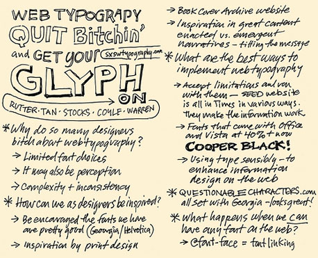
Typography enthusiasts filled the seats at the panel discussion Quit Bitchin’ and Get Your Glyph On, at which Jon, joined by four other standout typographers and designers, zeroed in on the imagined and real constraints of web typography. Panels are notorious for uneven results but this one, packed with resources, delivered — described on Twitter as “an incredible presentation” and “one of the best I saw.”
Because SXSW Interactive is spring’s epicenter for people who create web sites, even some of our geekier developers dipped their toes in the water. Chris Shiflett and Theo Schlossnagle braved this front-end cool kids’ conference and escaped relatively intact.
Want to learn more about typography?
- Jon Tan’s blog
- The Elements of Typographic Style (a classic book on typography by Robert Bringhurst)
- Thinking with Type (a solid yet approachable book on typography by Ellen Lupton)
- Detail in Typography (Jon’s review of a little gem of a treatise on microtypography)
Jon Tan’s next presentation:
Jon will be speaking at OSCON, July 2009, in San Jose, presenting Grokkin’ Design. As in the past, you’ll find many of us on the scheduled speaker list, attending sessions, and milling about the halls.